
Article: Beer Blends
When planning the 2014 European DoE User Meeting, we were faced with the challenge of hosting a fun evening event as well as giving the closing talk on the final conference day. After weighing up several options, we inevitably settled on our favourite topic: beer!
Written by Andrew Macpherson, Managing Director, and Dr. Paul Nelson, Technical Director.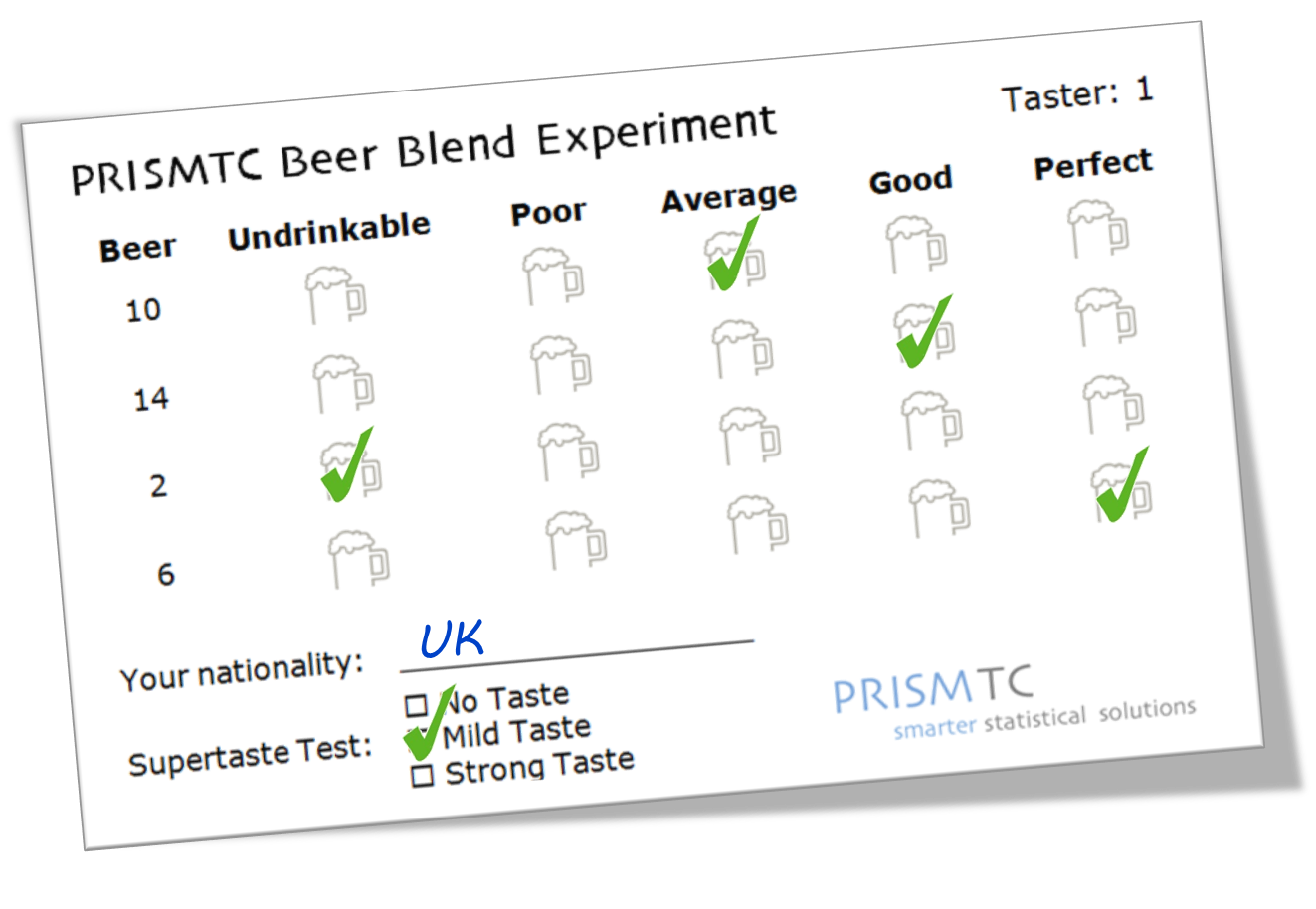
Introduction
Inspired by Mark Anderson's "Black and Blue Moon" experiment, we previously organised a mixture experiment to identify the optimal blend of three different beers. However, the results were disappointing, as most tasters preferred the "pure blends" (i.e. as the brewers intended!).
We thought we'd try to improve on our last attempt, and set up a constrained mixture design: this would cut out the pure blends, and force our tasters to decide how best to balance the three types of beer. The three beer types, along with our constrained factor ranges, were:
|
Beer Type |
Minimum |
Maximum |
|---|---|---|
|
Light Ale |
30% |
80% |
|
Bitter |
20% |
70% |
|
Dark Mild |
0% |
50% |
We thought that this would provide an enjoyable evening event and allow our delegates to get involved in some real-life experimentation - as well as giving us some data to present during our talk the following day...
Design Setup
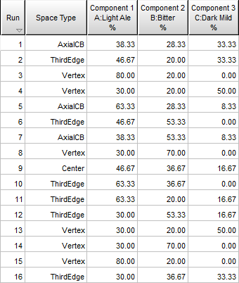
We decided to set up a design that would allow us to build a cubic model, which we felt would be more than adequate to identify any subtle synergistic relationships between the different beer types. We used Design Expert to create the required design (including a few replicates for good measure), incorporating the factor constraints as described above:
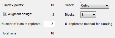
This gave us our 16-run design, as shown in tabular and graphical formats (labelled by run number):
Blocking
We knew that we'd have a number of beer enthusiasts among our delegates, but even so we thought it risky to ask them to taste 16 different beers!
We decided to ask each participant to taste a subset of the beers, therefore limiting their alcoholic intake to a more sensible level. We used some combinatorial logic to turn our 16 runs into a Balanced Incomplete Block Design (BIBD), working on the assumption that each participant would be willing and able to taste 4 beers.
This meant that if we could persuade 20 delegates to take part then every beer would have been fairly compared with every other beer exactly once. We had 57 people attending our event, so we were optimistic that there'd be enough interest to reach our target of 20 tasters... (As it turned out, we had no need to worry as an incredible 52 people volunteered for tasting duty, giving us plenty of data to work with!)
The Beers
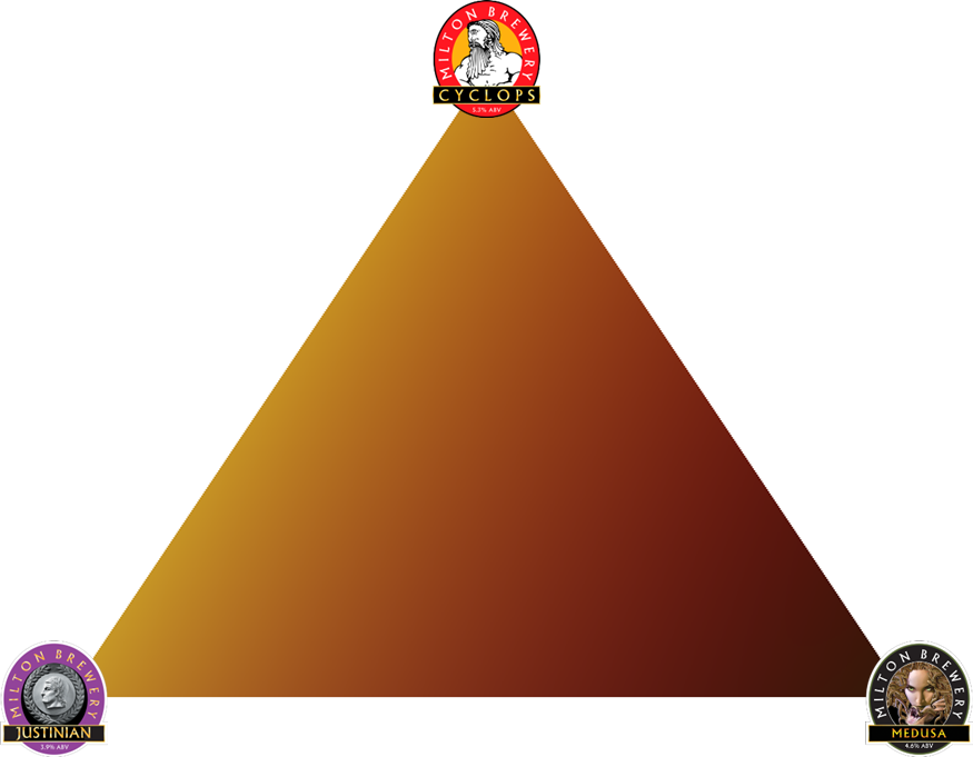
We then reached the most important part of the study: the beer! As the conference attracted delegates from across Europe, America and beyond we thought it would be good to showcase the award-winning local Milton Brewery. The beers we used are described below:
 |
Light Ale: Cyclops (5.3% ABV, £2.05 / pint). Light copper coloured ale, with a rich hoppy aroma, full body, fruit and malt notes develop in the finish. |
 |
Bitter: Justinian (3.9% ABV, £1.75 / pint). Crisp pale bronze-coloured bitter. Attractive bitter orange flavours persist into a satisfying lasting finish. |
 |
Dark Mild: Medusa (4.6% ABV, £1.95 / pint). Cocoa, vanilla and fruitcake aromas are backed by a satisfying yet subtle bitterness. Very drinkable. |
(Please note that the costs listed refer to the price paid when purchasing a barrel directly from the brewery in 2014. If you find a pub selling Milton beer at these prices then please let us know!)
Visualising the Mixture Space
To give a graphical indication of how the blends change as you vary the proportions of the three beers, we decided to visualise the mixture space in terms of colour. This was done after photographing several blends and analysing the RGB values:
Supertaste Test
During our planning we also spoke to another local brewer who suggested adding a "supertaste test" - this would show which of our tasters were more sensitive to bitter flavours, a genetic trait found in around 25% of the population. We also thought it'd be interesting to see whether there were any regional differences amongst our tasters, so decided to record each taster's nationality.
Capturing the Results
We created a scorecard that gave each taster their four beers (in randomised order), along with a simple 5-point hedonic scale to record their score for each blend:
Although the taste score is not continuous, we knew that each beer would be tasted several times so we decided to analyse the mean taste score as our primary response. For each blend we also calculated the strength and cost per pint, to analyse as secondary responses.
Running the Experiments
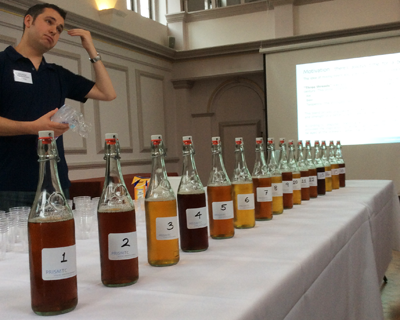
Finally, after months of careful planning and preparation, we concocted our beer blends (it was thirsty work!):
Our tasters then descended upon our "laboratory" and got enthusiastically stuck into the hard task of tasting the beers! After collecting the completed scorecards and entering the results we were able to begin our analysis...
Analysis: Taste
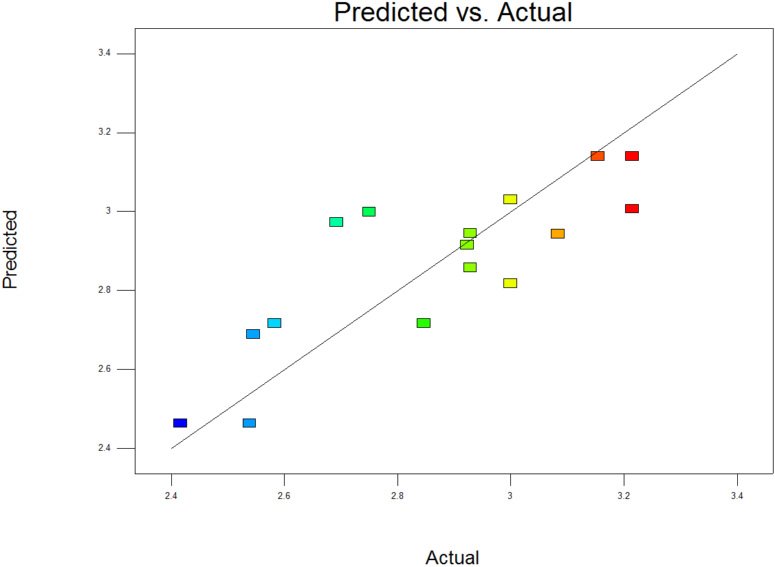
We began with the mean Taste response. Using the Backward selection method on a Cubic model resulted in a model consisting of the linear terms and a statistically significant interaction between the Light Ale and the Bitter. The model summary metrics looked good, considering the variable nature of the response; the Predicted vs Actual chart shows a reasonably good predictive model:
We then moved on to review the Model Graphs, starting with the Contour Plot:
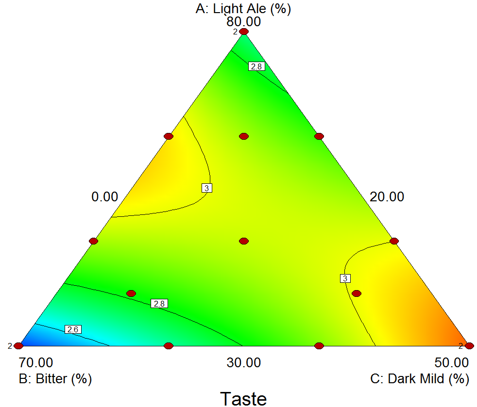
The brighter red and yellow colours show the highest average taste scores, so there appear to be two regions where we achieved good blends: with the highest proportion of Dark Mild (at the bottom right), and also the midpoint between the vertices for Light Ale and Bitter.
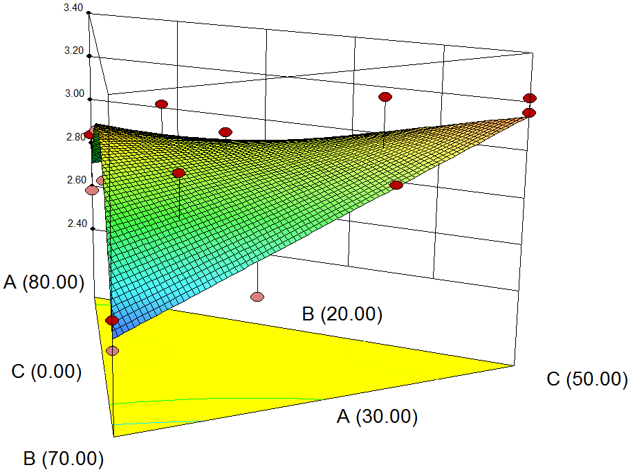
The 3D Surface Plot shows a ridge between the two regions, suggesting that any point along this line will give a similarly good taste.
What does this mean in practice? Well, it seems that if you start with a 60/40 split between the Light Ale and Bitter, you can add the Dark Mild as desired: if you prefer your beers light then don't add any at all, whereas if you like a darker drink then add the Dark Mild until it makes up 50% of the total quantity!
The lowest mean taste scores were observed where we had the highest proportion of bitter (the bottom left corner in the Contour Plot above). The results from our "supertaste test" provided one interesting theory for this: almost 40% of our tasters recorded a strong reaction to this test, meaning that they are more sensitive than most to bitter flavours. Could this be why they had such a dislike of our bitter-heavy blends?
Analysis: Cost
We then looked at the Cost response, which we calculated as a weighted average of the price per pint of the three different beers. The model was therefore a simple linear model, giving the following Contour Plot:
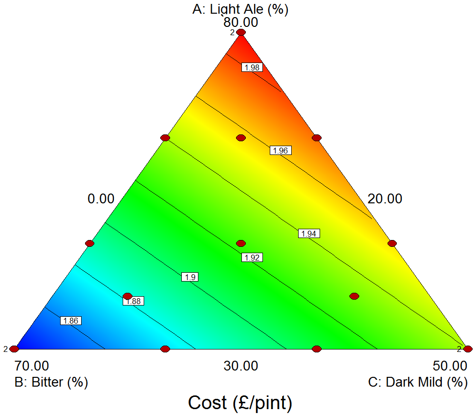
With this response we're looking for the minimum values, to give us the cheapest drink! Unfortunately the cheapest beers (blue) are in the bottom left corner, which corresponds to the blends with the highest proportion of Bitter - and we know from analysing the Taste response that this was our least popular region (although, in fairness to the brewery, it is an excellent pint when consumed in its pure form as intended!).
Although not shown here, the Strength response followed exactly the same pattern as the Cost response above: this is not surprising, as the brewery prices its pints by their alcoholic strength!
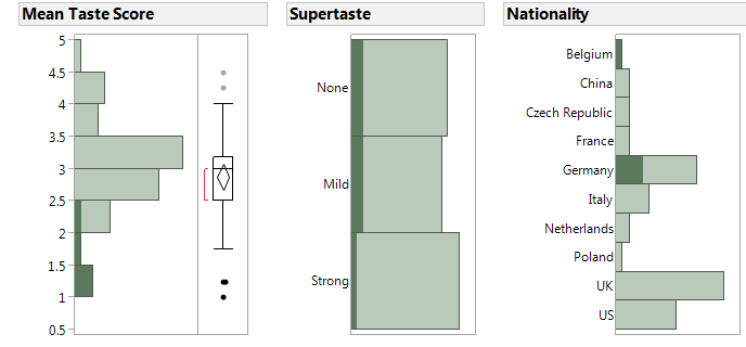
Supertaste and Nationality Results
We performed a quick visual analysis to assess the supertaste results and nationality of each taster. We averaged the four scores for each taster, and looked for any obvious patterns or groupings for the tasters who rated their beers consistently high or low...
We started by selecting all the highest scores on the left-hand graph below; this then highlights the corresponding supertaste results and nationalities. It appears that there might be a slightly higher proportion of tasters who didn't respond to the supertaste test. However, the nationality seems to show a more obvious pattern: it looks like the people who enjoyed their beers most came from China, the UK or America.
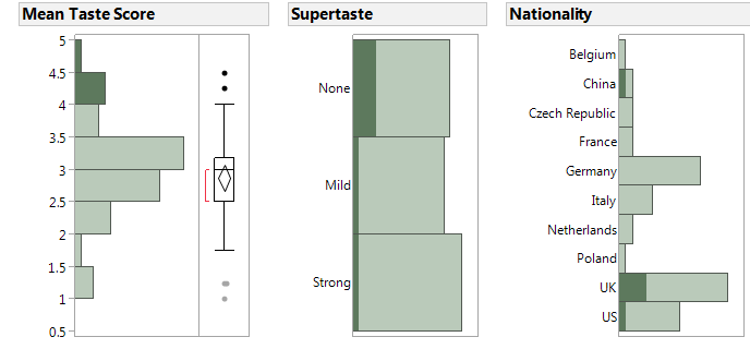
Comparing this to the tasters who rated their beers lower, there's no obvious connection between low scores and the supertaste test. Again though, the nationality of the taster does seem to be related to their scores; it suggests that our Belgian and German delegates were hardest to please!
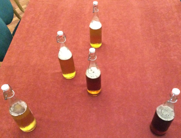
Conclusions
Our overall goal was to find the best-tasting beer with the cheapest cost. Using the Optimisation tool within Design Expert we arrived at the following Contour Plot for Desirability:
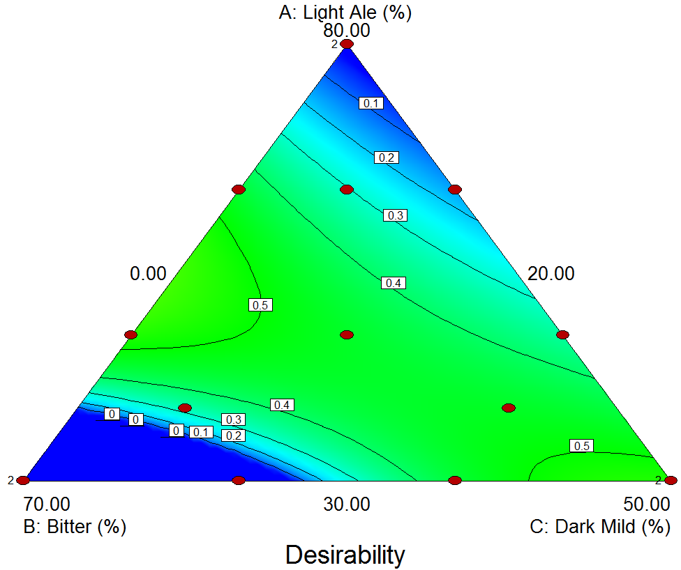
This again shows the diagonal ridge, as described for the Taste response. This is great news for us beer fans, as it means we can easily create a beer blend to suit every taste from light to dark! We mixed a few of the best blends (as shown below, laid out to correspond to the chart above); we wanted to perform some confirmation runs and verify that the results tasted good (they did!).
We hope that you've found our experiment and this summary interesting! Please contact us if you have any questions or comments, or if you'd like the DX file to analyse yourself!
Be the first to know about new blogs, upcoming courses, events, news and offers by joining our mailing list here.