
How To: Analyse a 2-level factorial design using Minitab
Harness the benefits of Design of Experiments (DoE) with this guide to analysing your first design in Minitab!
Written by Andrew Macpherson, Managing Director.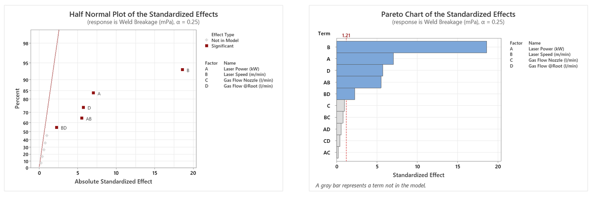
In this How To blog, we're going to walk you through the analysis of a 2-level full factorial design using Minitab, a popular general purpose statistical software package. We hope this guide will help those of you starting out in the world of experimental design, whilst also acting as a useful tip sheet for attendees on our various DoE training courses. In the interests of brevity, we will not delve in to too much statistical detail here; however, we offer in-depth support to anyone who needs it, so please feel free to drop us a line for further information!
This blog follows on from our previous How To: Set up a factorial design in Minitab article, so please start with that before enjoying this one!
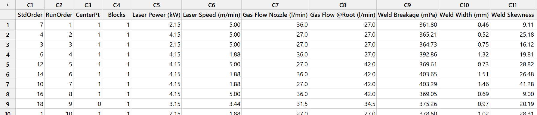
So, we’ll start with the full factorial design that we set up in the previous blog, but here you can see that we’ve performed the experiments and fed in the values for our three responses: Weld Breakage, Weld Width and Weld Skewness. The study consists of 18 runs; 16 runs for the full factorial “corner points”, plus the 2 centre points that we specified when constructing the design.
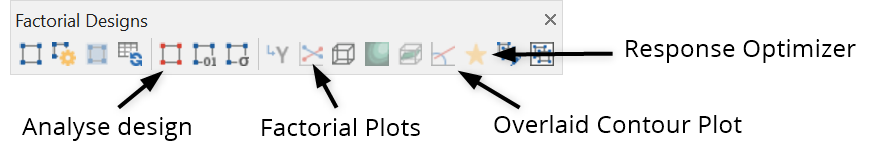
In the last blog, we recommended adding the “Factorial Designs” floating toolbar, to provide easy access to the functionality that we’ll be using. The floating toolbar is shown here, along with the features that we’ll be mentioning in this guide (there are obviously more options to explore, but we’ll limit ourselves to these few in this overview!).
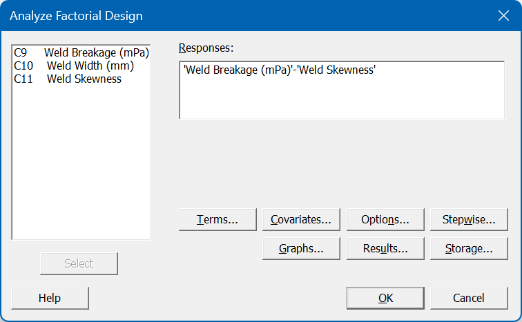
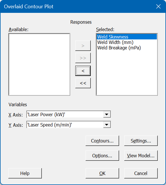
To begin our analysis, click the Analyse design button, then select the three responses as shown below:
We’ll then work through a few of the key sub-items:
- Terms: we will ask Minitab to include all effects up to order 2. This means that we’ll estimate the linear / main effects of each factor (i.e. how much the responses change as we vary the factors from their low to high conditions), as well as assessing all 2-way interactions between the 4 factors. We will exclude the centre points from our model, as we are not attempting to model any nonlinear behaviour; we are simply looking to see whether there’s any evidence of curvature, which may indicate the need to explore further via additional experiments.
- Stepwise: we will specify an automated Forward selection method. This will automatically select any main effects and/or 2-factor interactions (2FIs) that stand out over and above the background noise.
- Graphs: we will request Pareto and Half Normal plots, displaying all model terms. We can then check that Minitab’s automated forward selection method has provided a sensible model – we can compare the size of the selected effects to the ones deemed too insignificant. Also, we will request Standardised four-in-one residual plots, which will enable us to perform further diagnostic checks.
After specifying our analysis options as described above, we will return to the analysis dialog and click OK. Minitab will then analyse our three responses and generate a statistical model report for each. We will not go into the statistical details of the Coded Coefficients, Model Summary and Analysis of Variance tables here, but these should all be carefully reviewed to ensure that there are no issues with the model. One important check is whether there is any evidence of curvature; in this analysis, the curvature was not significant – this means that the linear models discussed here are adequate across the chosen factor ranges.
There are also some useful visual tools that we can check, such as the Half Normal plot (all graphs shown here relate to the first of our responses, Weld Breakage):
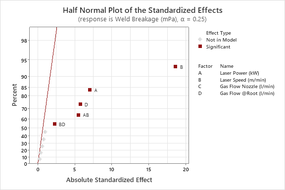
The graph above allows us to assess the size of the selected model terms; the dark red line represents the background noise in our response, so we are looking to see which effects fall away from this line to the right-hand side. The further from the line, the stronger the effect is – so we can see here that the largest effect on Weld Breakage is factor B (Laser Speed). Working our way from right to left, we can see the selected effects in descending order of size: A, D, AB and BD. Alternatively, we can review the Pareto chart to see the same information displayed in a different manner. This also displays the main effects and interactions in descending order of size, highlighting those which are large enough to exceed the indicated statistical significance threshold.
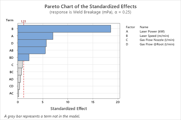
The Pareto and Half Normal plots indicate that three of our four factors have a significant influence on the response, and we have also identified two 2FIs. To take the AB interaction as an example, this tells us that the effect of factor A (Laser Power) depends on the setting of factor B (Laser Speed) – this information might be extremely valuable in helping us to fully optimise our process!
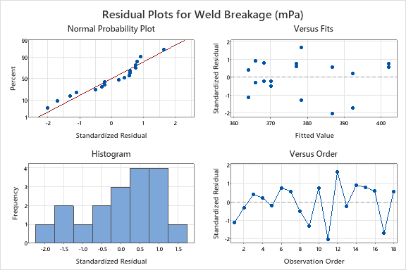
We should also review the Residual plots provided by Minitab, to ensure that there are no systematic flaws in our model. Again, we will not discuss the details here – if you would like to learn more about our recommended approach to analysing your designs, then you may wish to attend our Effective DoE Implementation workshop.
Assuming that we are happy with the reports and charts mentioned above, we can then start to use the fitted model to create further output. The first thing that we may wish to understand is how each factor affects our responses – for that, we can click the Factorial Plots button on the floating toolbar to generate the following (again, the output here relates to the Weld Breakage response):
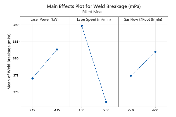
The three panels visualise the effect of three factors on the Weld Breakage response; please note that the fourth factor, Gas Flow Nozzle, is not shown because it was not deemed significant enough to be selected for the Weld Breakage model. These simple plots show us that, if we want to maximise our response, we should choose the highest settings for Laser Power and Gas Flow @Root, and the lowest setting for Laser Speed. What about Gas Flow Nozzle? Well, it doesn’t matter! We can select any value we like within the explored range, and it will not affect this response – more potentially useful process knowledge!
However, we know that there are also some significant interactions at play here, so we should not consider the effects of the factors in isolation… thankfully, Minitab also provides us with Interaction Plots, which show the nature of the detected dependent relationships:
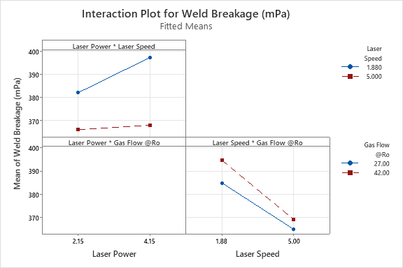
Taking the top-left graph as an example, this shows the Laser Power * Laser Speed interaction. The solid blue line shows the effect of Laser Power when Laser Speed is low; the dashed red line shows how Laser Power affects the response when Laser Speed is high. We can see that the slopes of the two lines are different, which shows that the effect of Laser Power does depend on the settings of Laser Speed (or, in statistical language, there is a significant interaction between these two factors). If we want to achieve the highest possible Weld Breakage results, then we need to run at the combination of high Laser Power and low Laser Speed.
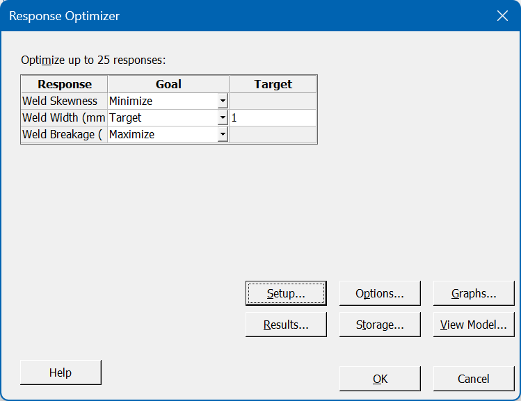
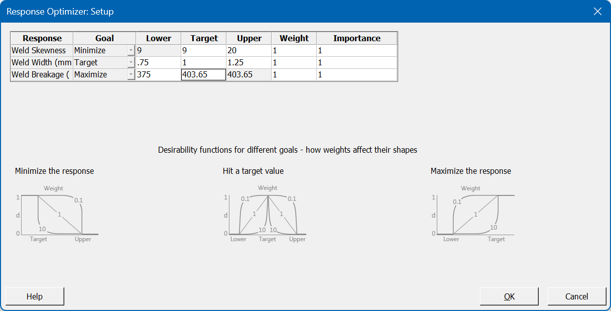
After reviewing the relevant output for all our responses, we are likely to want to find the overall optimal conditions; that is, the combination of factor settings that achieves the desired results for all responses simultaneously. For this, we can use Minitab’s Response Optimiser tool; the initial dialog allows us to specify the goal types, and we can then enter the specification limits via the Setup button:
Minitab attempts to find a solution where all criteria are satisfied; in this example, it succeeds and provides us with the following interactive tool:
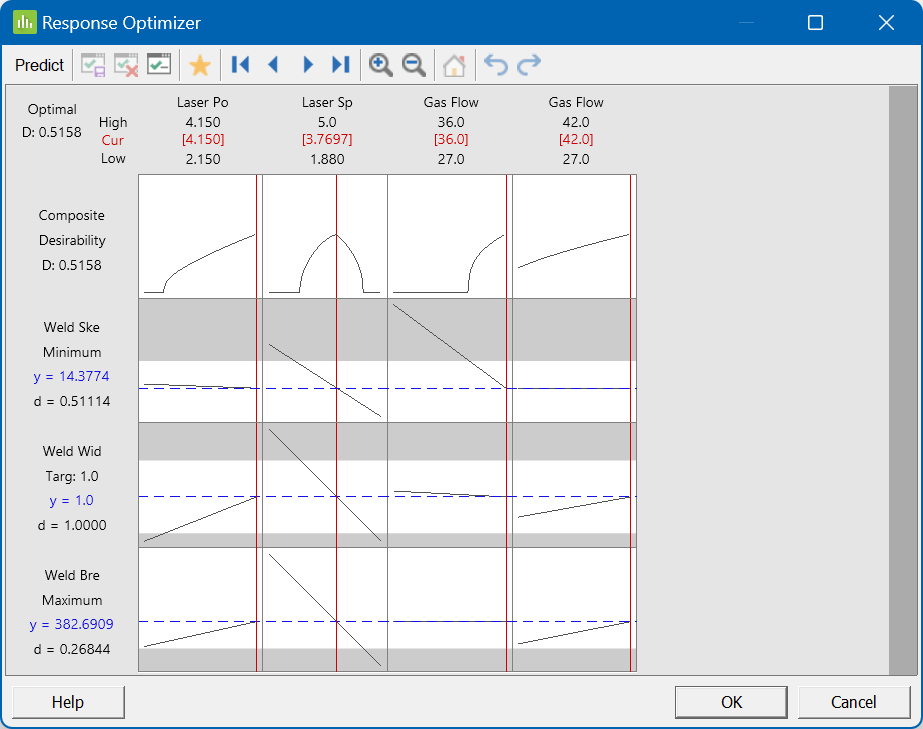
The four columns in the graph grid above represent the four factors. The first row shows the desirability profile for each factor; this shows where the optimal conditions for each factor lie. Rows 2-4 of the grid show how the factors affect the three responses individually. By default, the optimal settings are selected – but, if you’d like to explore alternative settings, you can move the factor settings around to see what effect that would have!
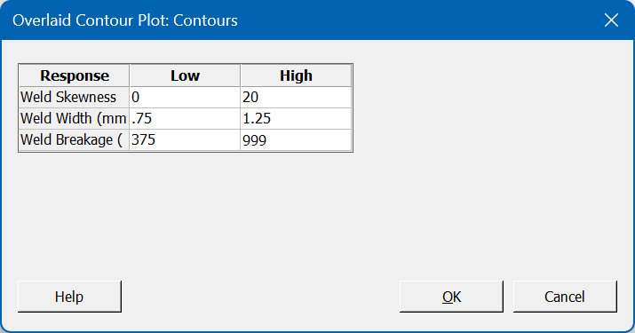
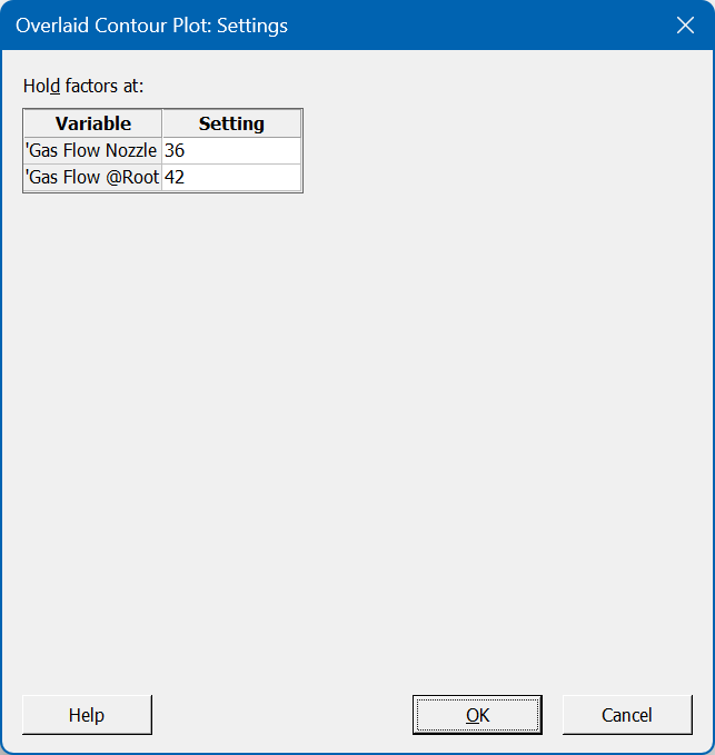
Once we have identified our preferred optimal settings, we can create a final visualisation that will show how robust the settings are; we launch the Overlaid Contour Plot, and select two factors that we’d like to display. We can then enter our specification limits via the Contours button, and choose our preferred settings for the factors not displayed on the chart:
After we confirm these options, the Overlaid Contour Plot is produced:
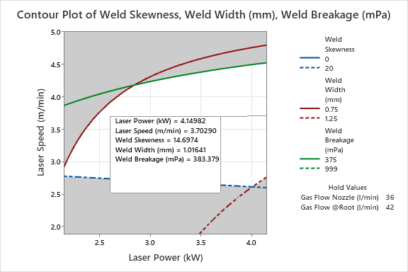
The white region represents the area where we are within specification for all our responses; the green, red and blue lines represent the edges of failure for Weld Breakage, Weld Width and Weld Skewness respectively. If we cross any of these lines, we enter a grey region that indicates a failure on one (or more) response. In the chart above, we have added a note to indicate our ideal settings – roughly half way up the right-hand side of the graph, which is equivalent to Laser Power at its maximum setting and a Laser Speed of around 3.7 m/min. The Laser Speed setting is trying to strike a balance; if we go too high, we risk failing on Weld Breakage, but if we go too low then we risk failing Weld Width and Weld Skewness!
Well done – you have now competed your DoE analysis in Minitab! In an efficient study, we have gained a valuable understanding of how our factors affect our responses, both independently and dependently (i.e. through main effects and 2-factor interactions). We have constructed models that relate these inputs to our outputs, and we have assessed these models to ensure their reliability. Finally, we have used the models to predict the optimal process conditions, and created a visual tool to show where the edges of failure are likely to be. Not bad!
If you found this guide useful, or are interested in the wide range of Design of Experiments workshops we offer, please contact us. We'd love to hear from you.
Be the first to know about new blogs, upcoming courses, events, news and offers by joining our mailing list here.